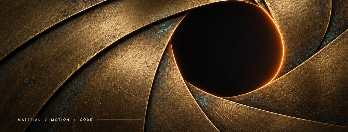
A little giant.A wider view.
How a friendly one-eyed character became a direction for Giant Aperture. Follow the references, shape decisions and material response behind the current direction.
A friendly way in.
The name suggests scale and an opening. A soft, single-eyed giant connects those ideas: a welcoming character whose eye belongs to the same optical world as the site.
The character can become a letter.
A rounded crown and a wide, settled base suggest an A. It can stand beside the full name or take the first A’s place in aperture.
Soft A is the selected direction. These drawings explore its construction; they are not a final logo.
Softness, with structure.
The glass-jelly reference set the material direction. A sea slug’s mantle suggested how a continuous body could rest on the floor without separate feet.
Keep the useful observations.
- A broad, rounded crown gives a calm upper silhouette.
- Large folds belong to one continuous body.
- The eye supplies the expression; a smile adds another focal point.
The vector drawing simplifies these qualities. Its flat colour and highlights suggest jelly; they do not reproduce photographic glass.
Keep the crown.
Quiet the hem.
A wider crown, no mouth and fewer waves became the constraints. These two remaining comparisons hold the upper shape steady and change how the body meets the floor.
Quiet hem keeps the outline simple. High drape carries more depth at larger sizes. The final hem remains a choice, rather than a completed identity decision.
Light makes the form.
The character’s glass and the site’s iris share a visual language. Image studies set a target; the native iris tests which qualities remain coherent as the blades move.
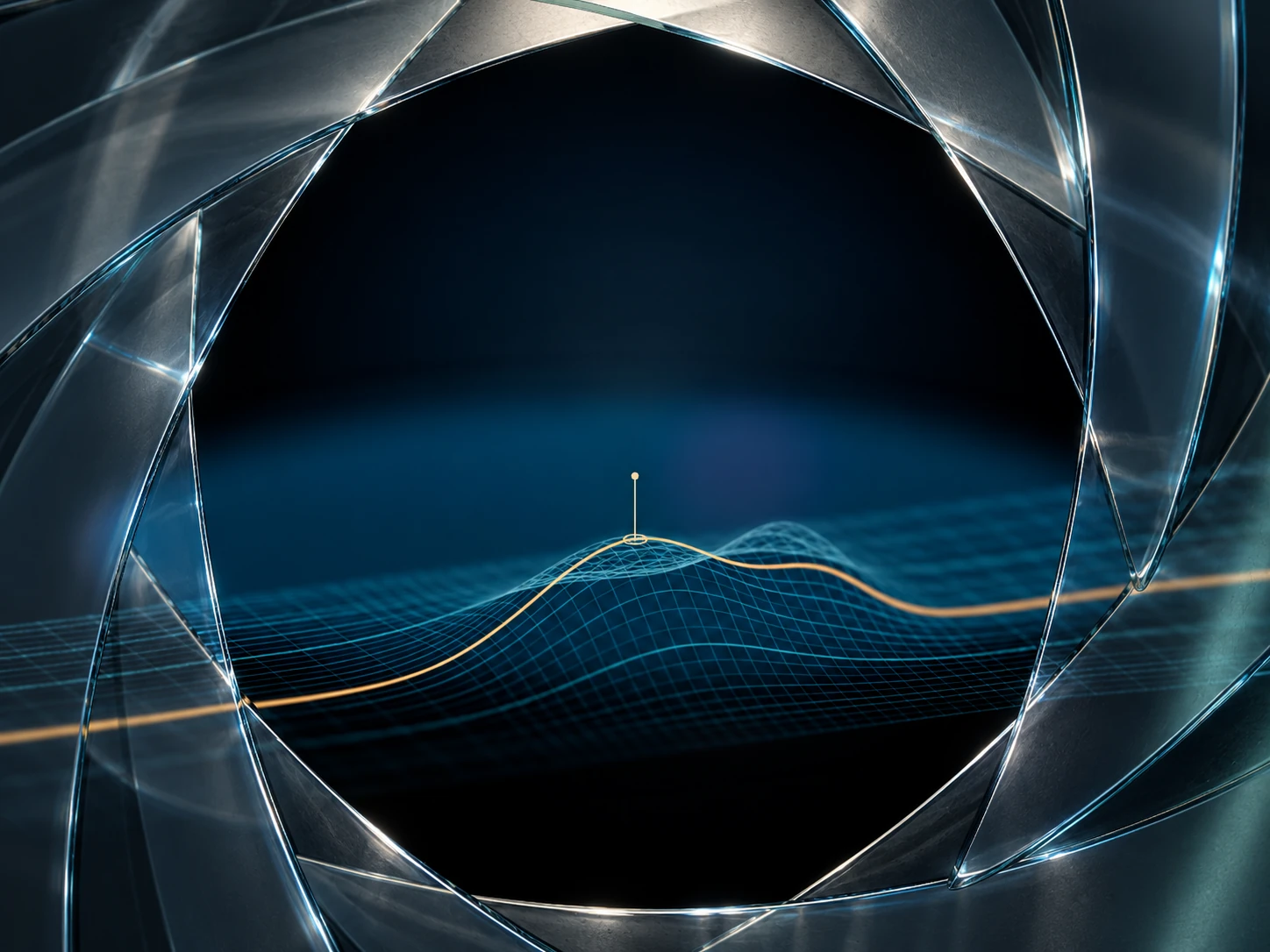
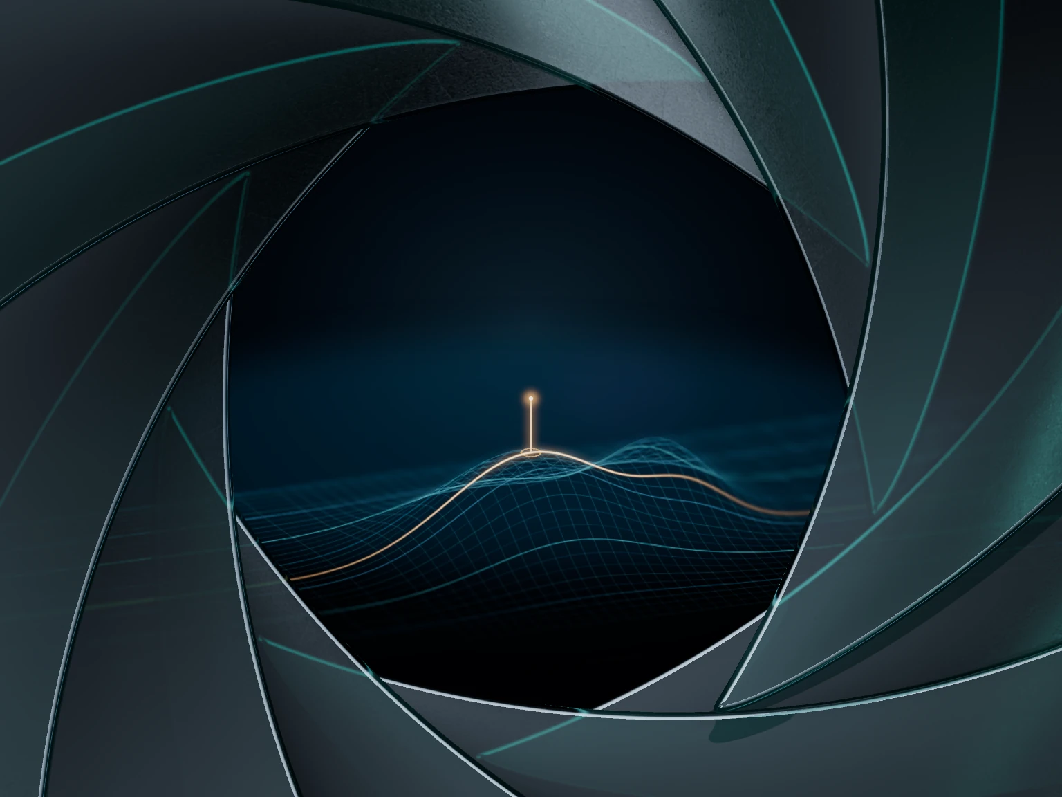
Broad reflection gives the faces volume. Selective bright edges suggest polished thickness. Fine texture softens transmission without turning the whole blade opaque.
Those effects belong to moving blade coordinates and the light setup. A generated image supplies appearance evidence; it cannot establish correct geometry or coordinated motion.